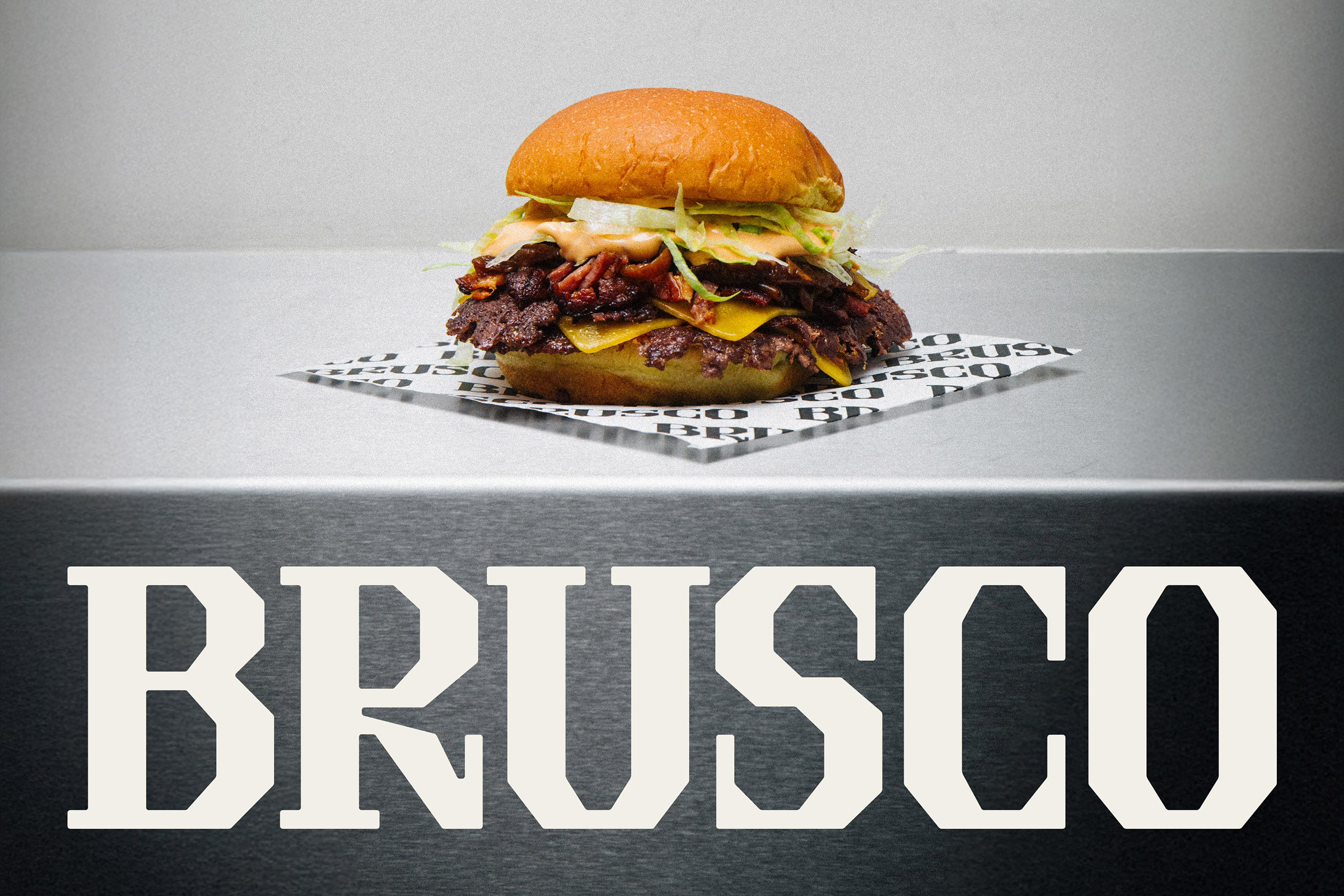
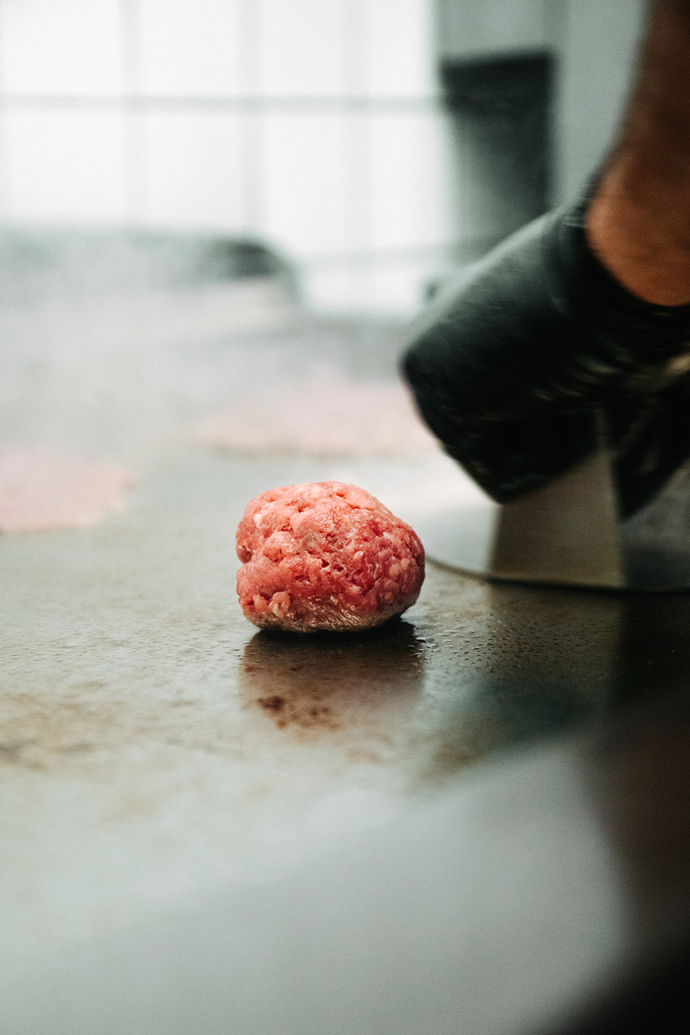
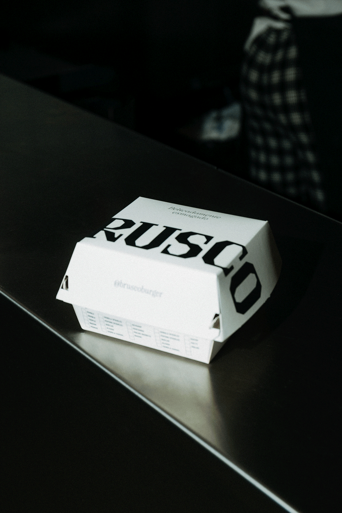
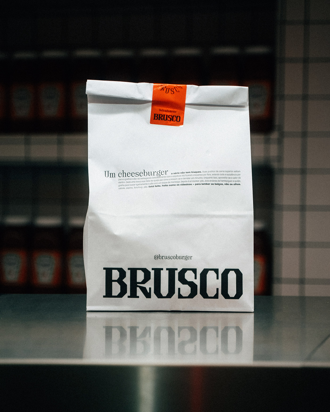
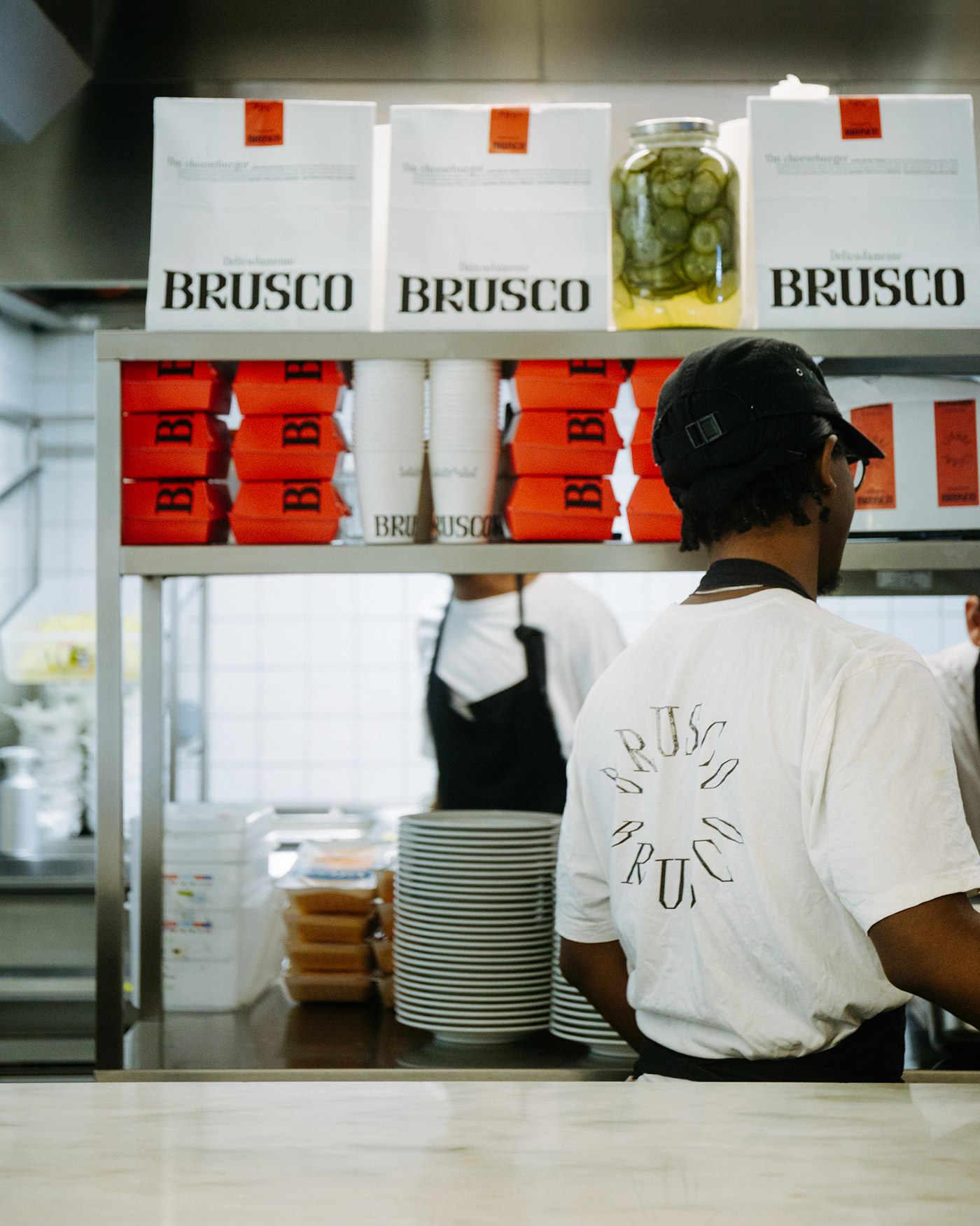
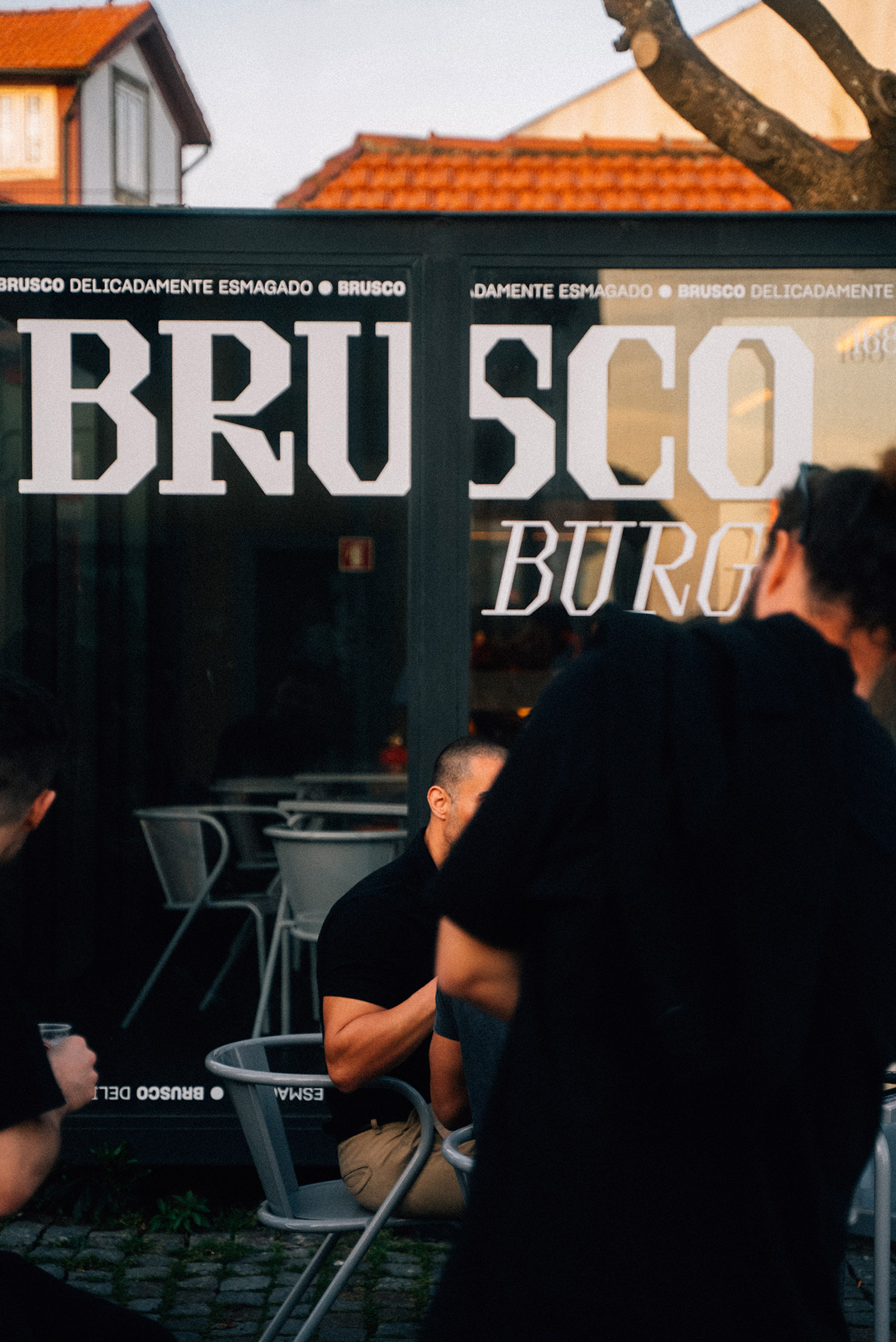
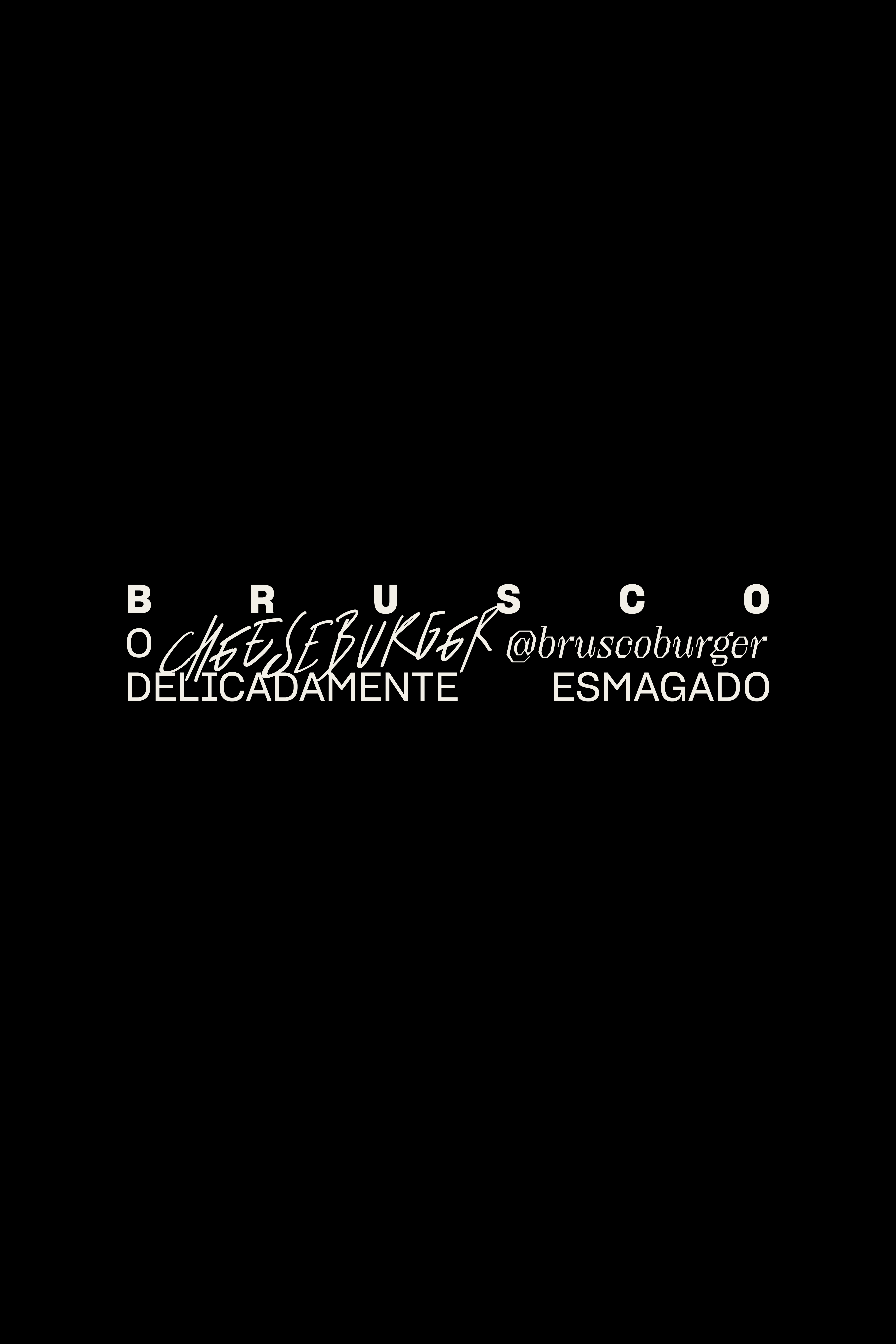
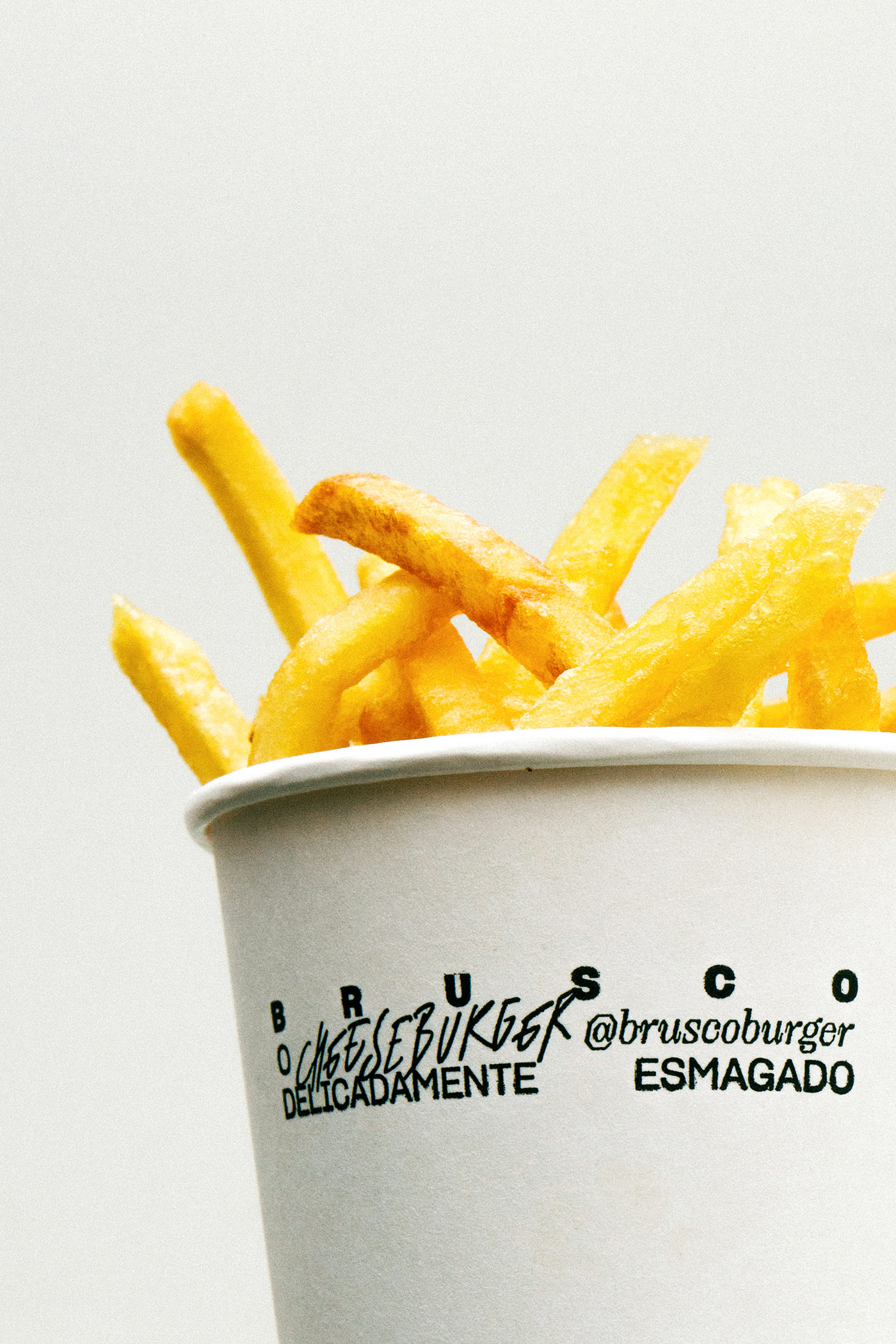
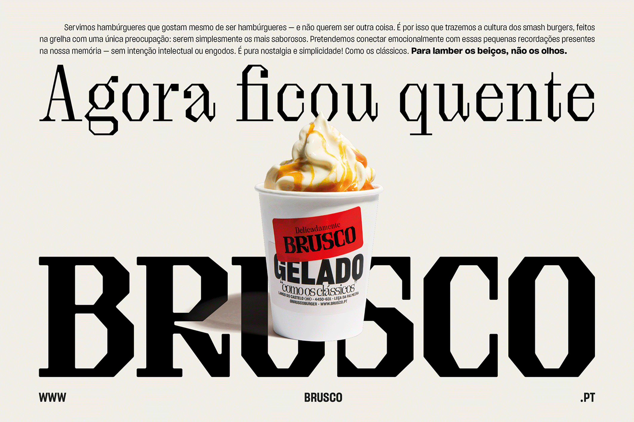
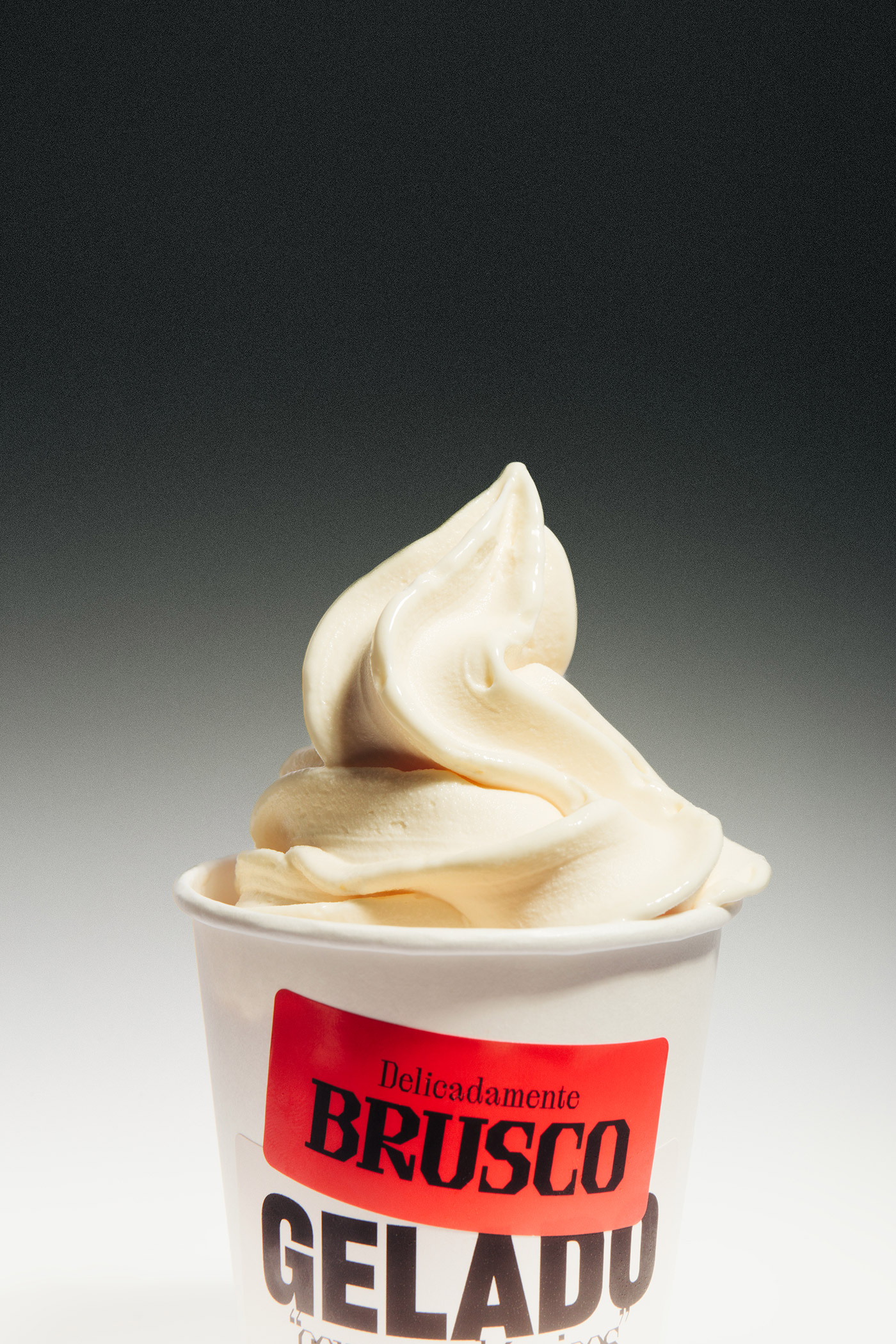
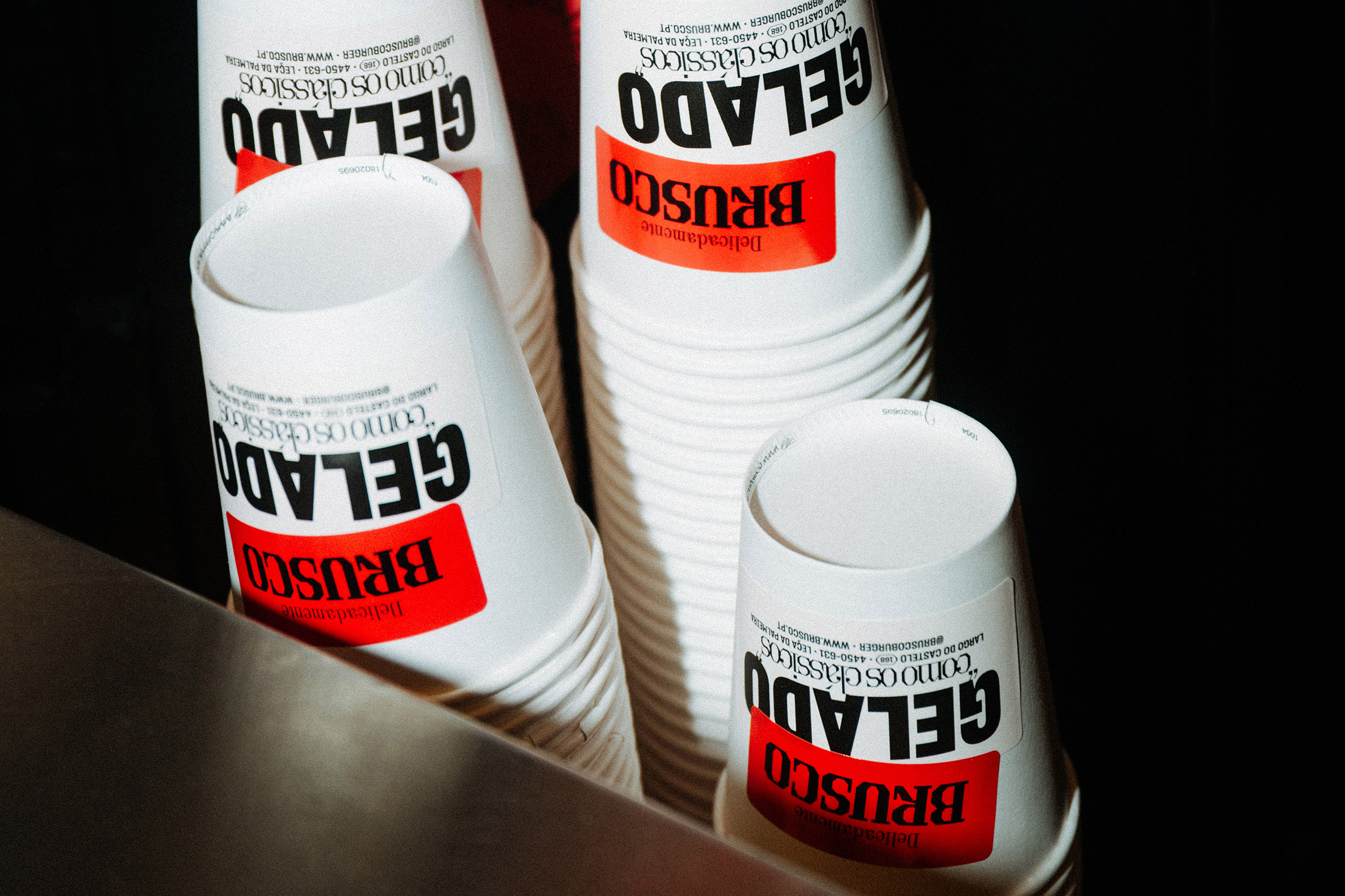
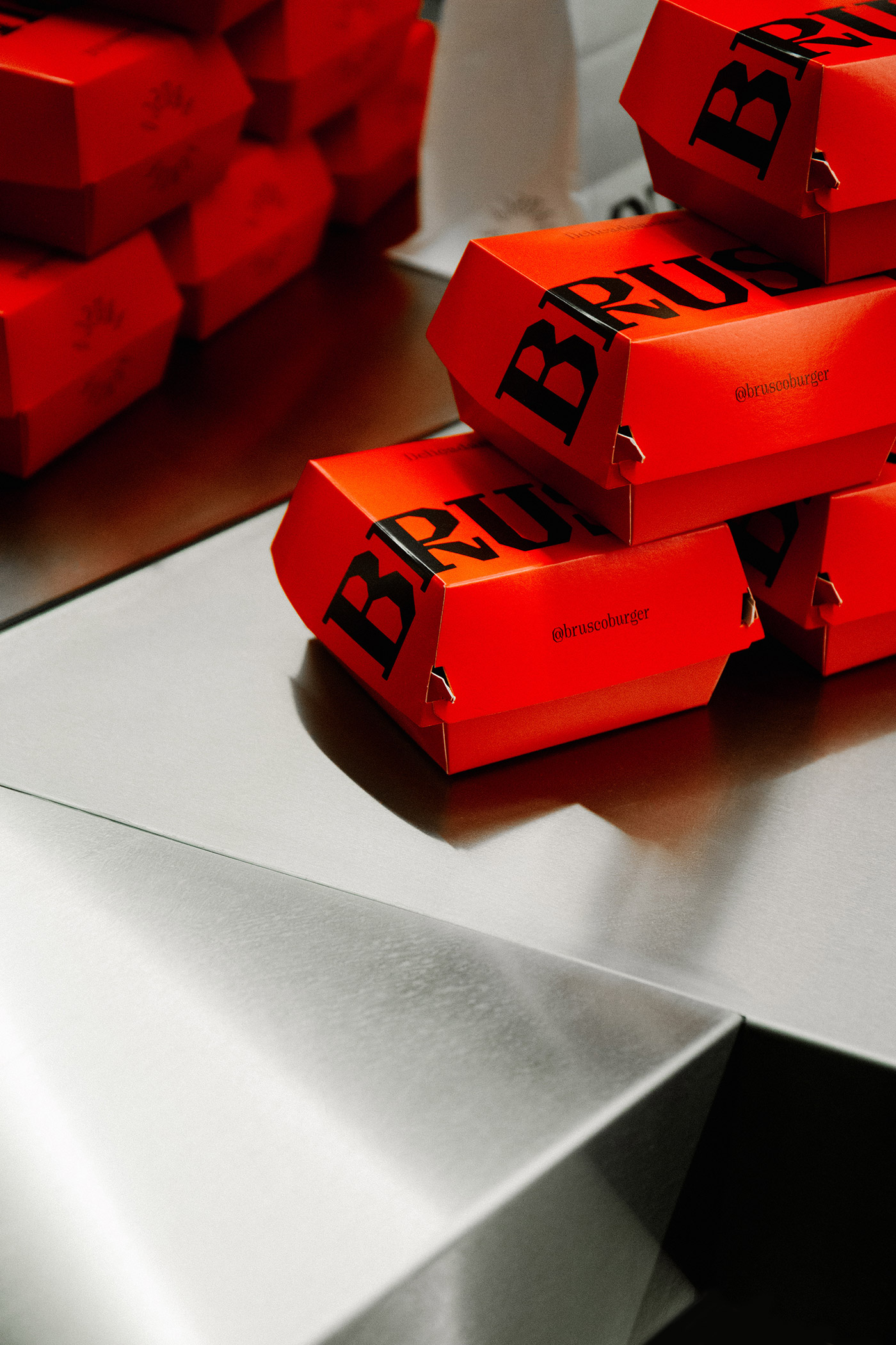
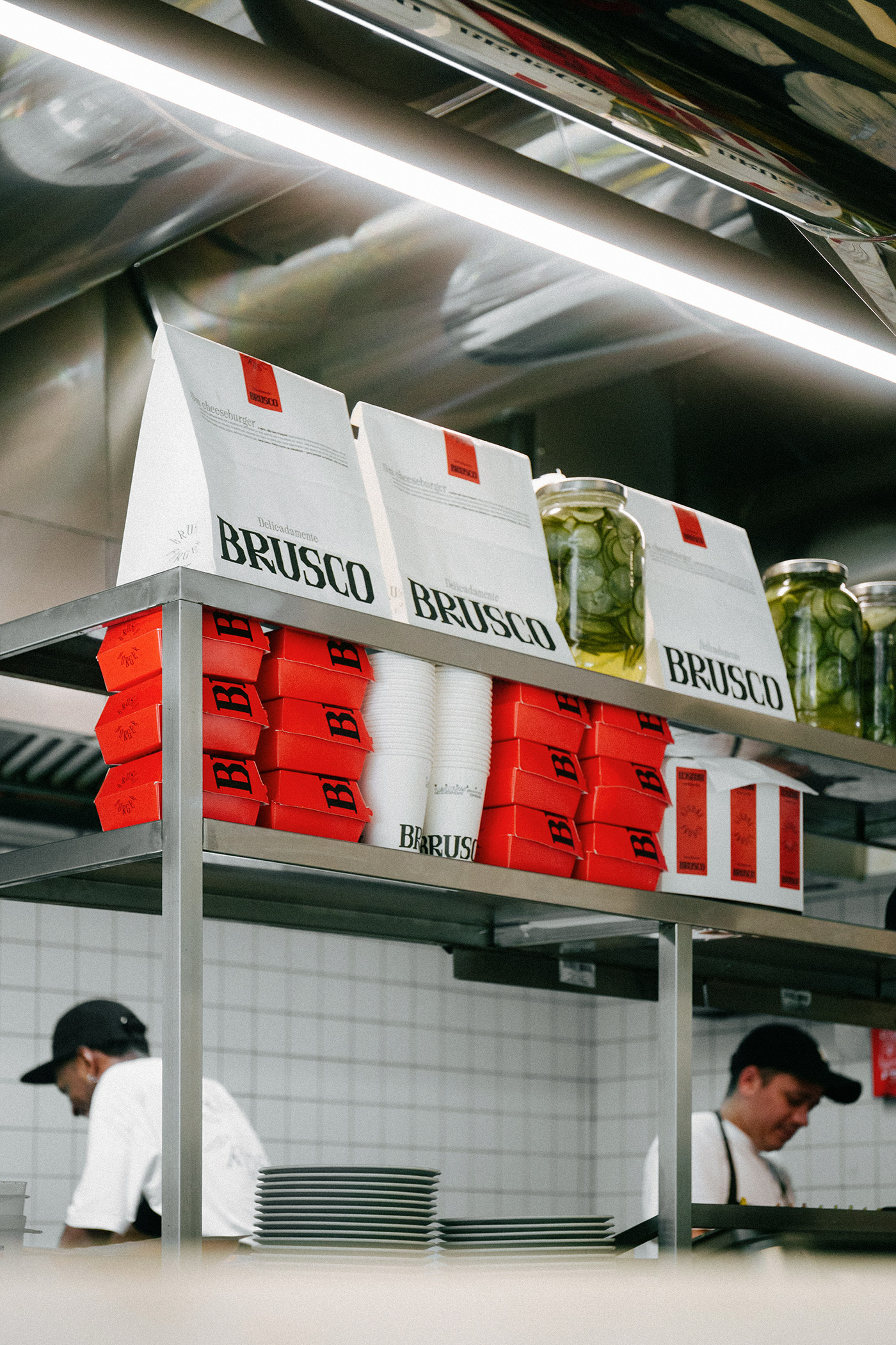
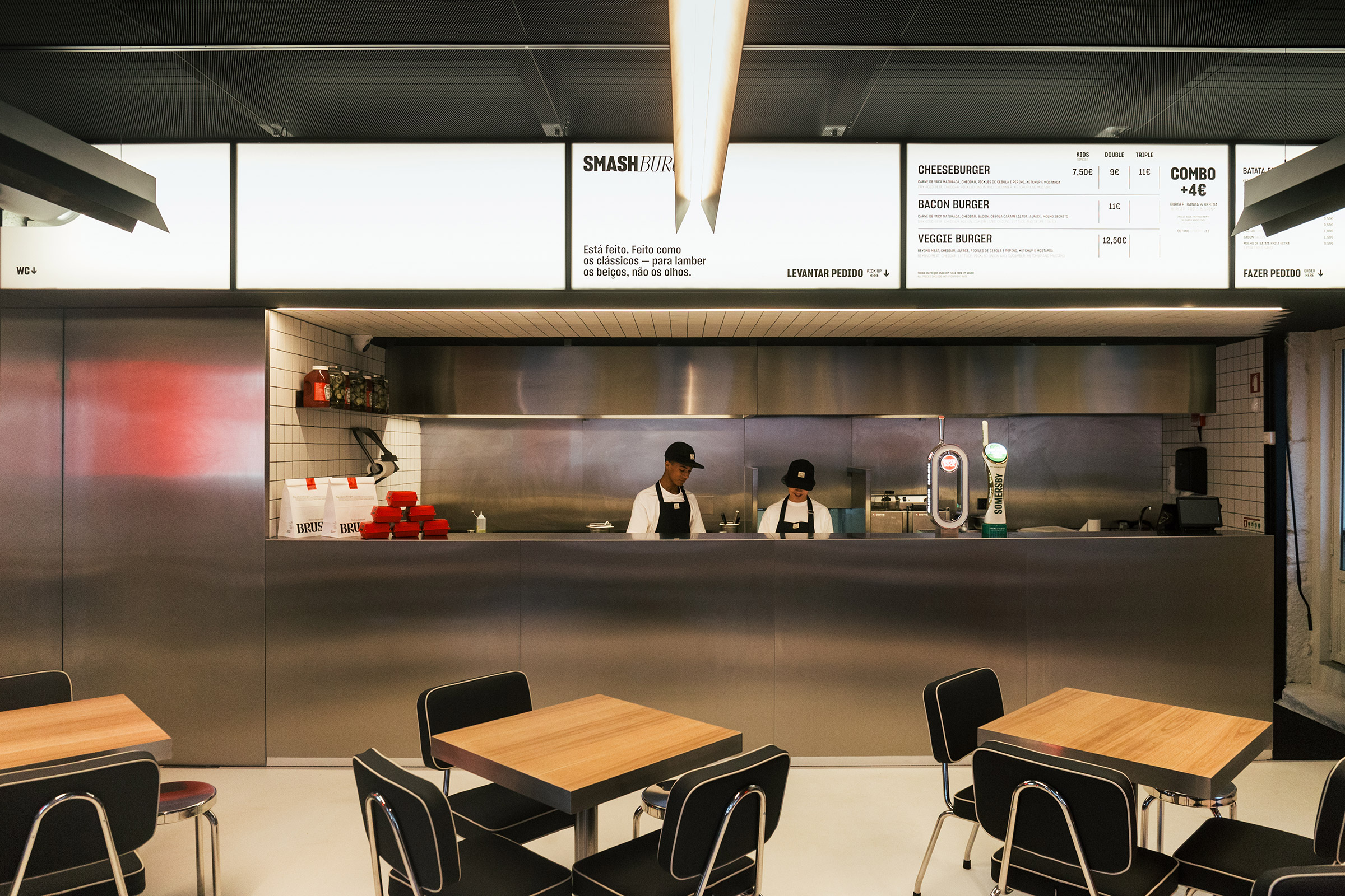
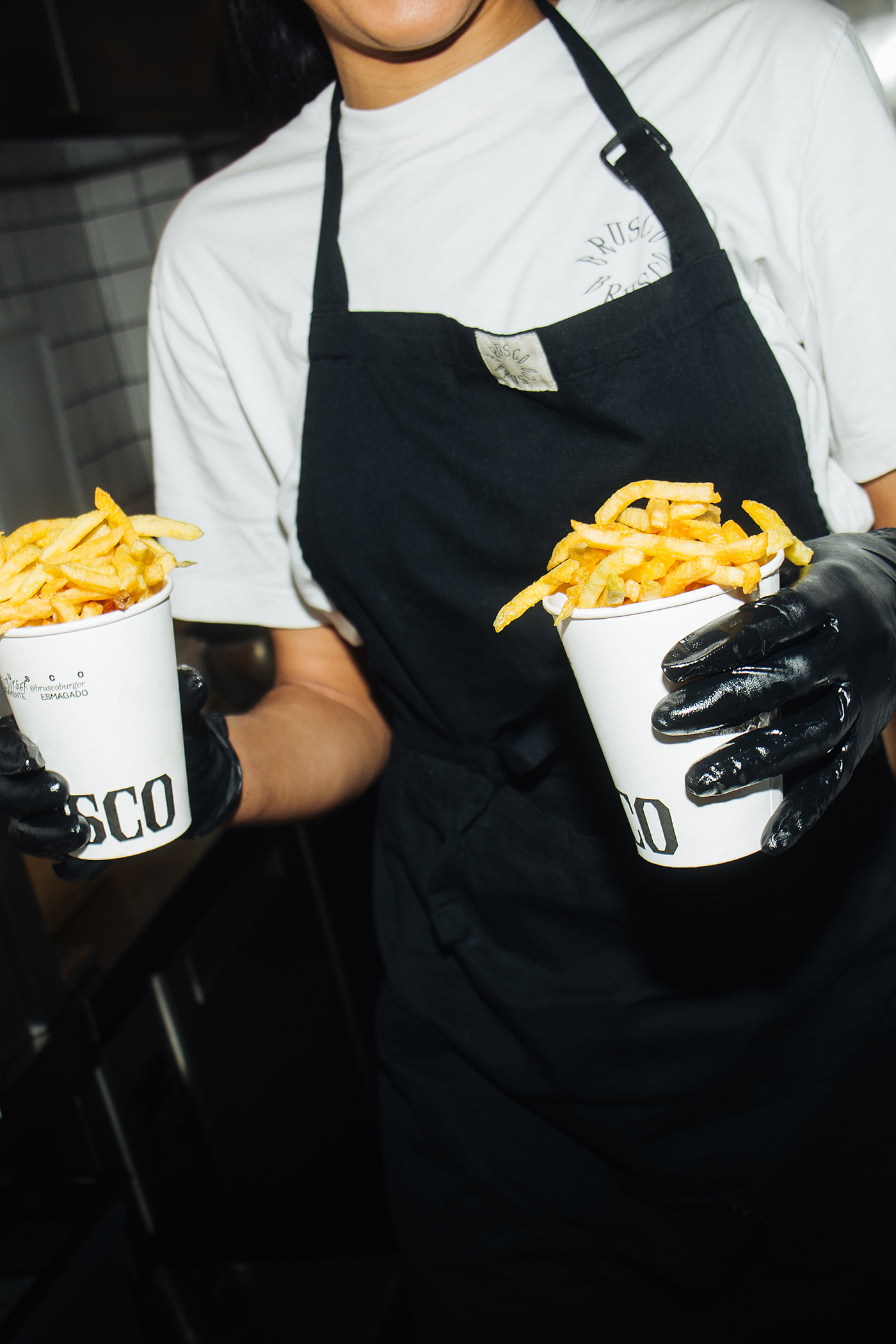
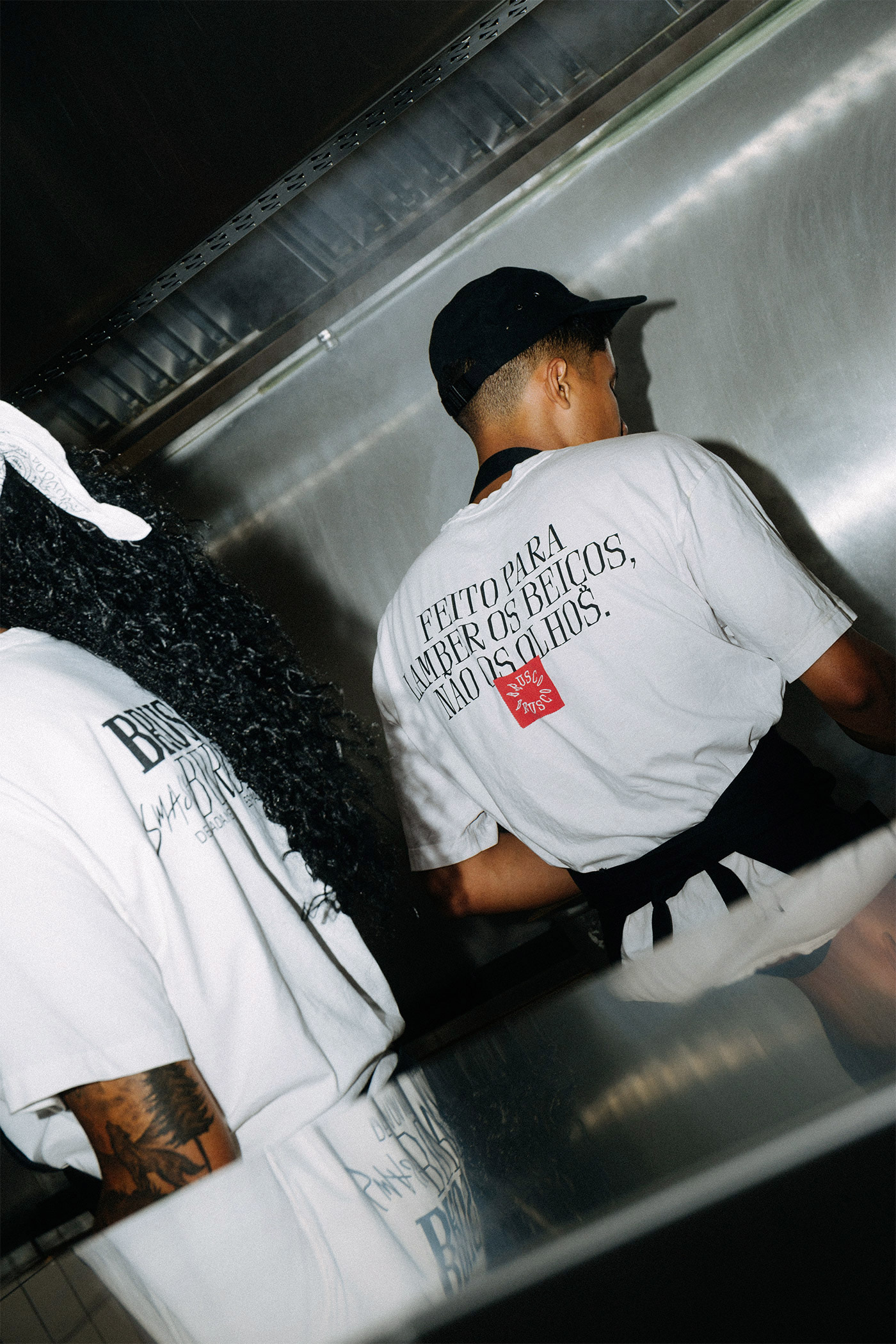
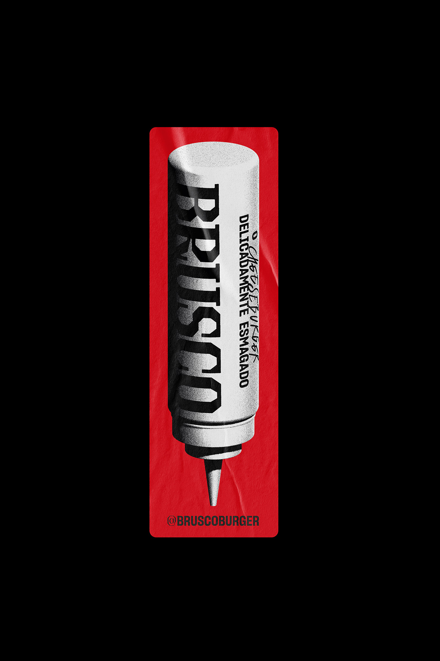
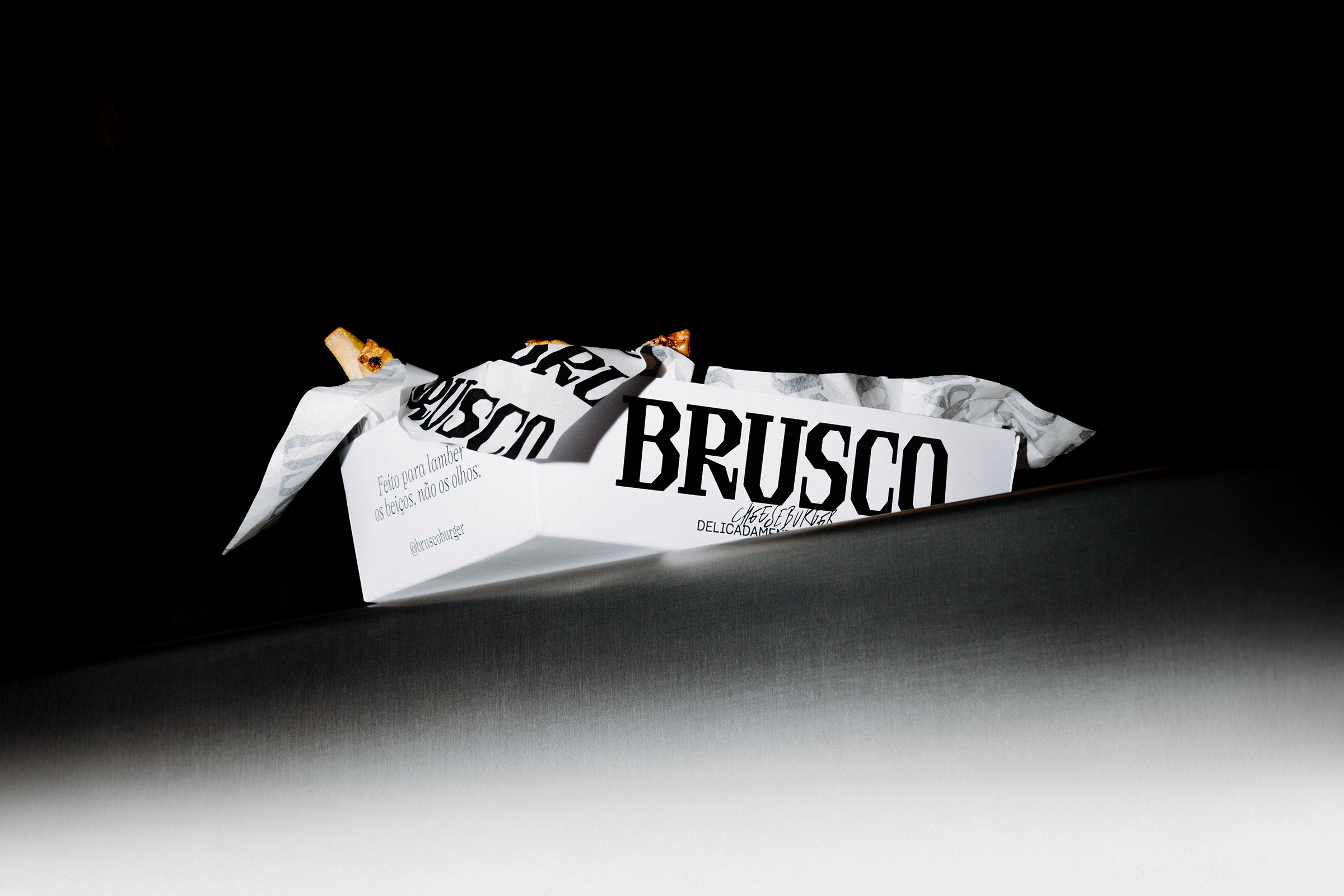
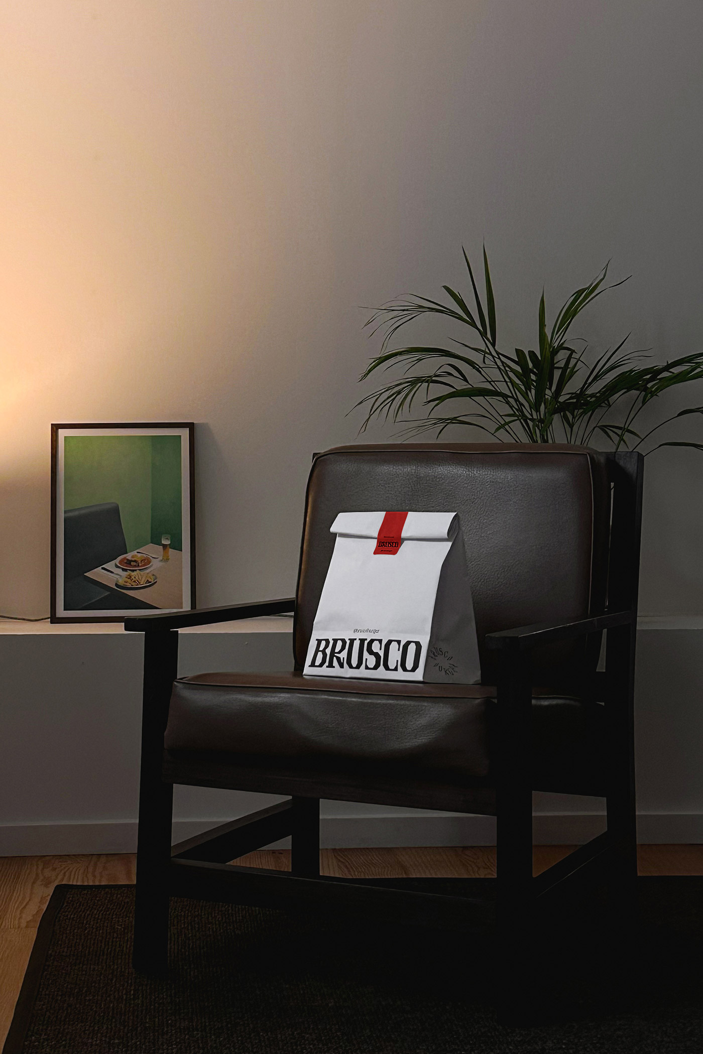
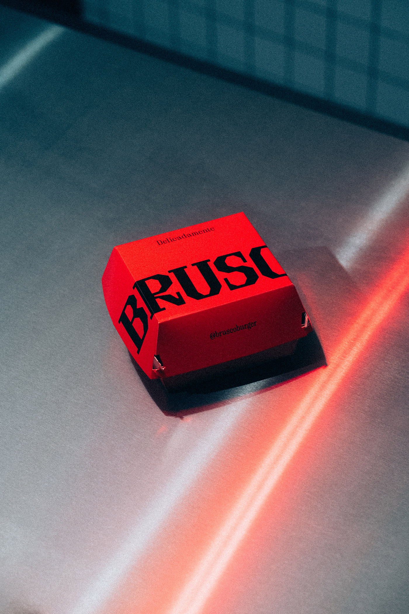
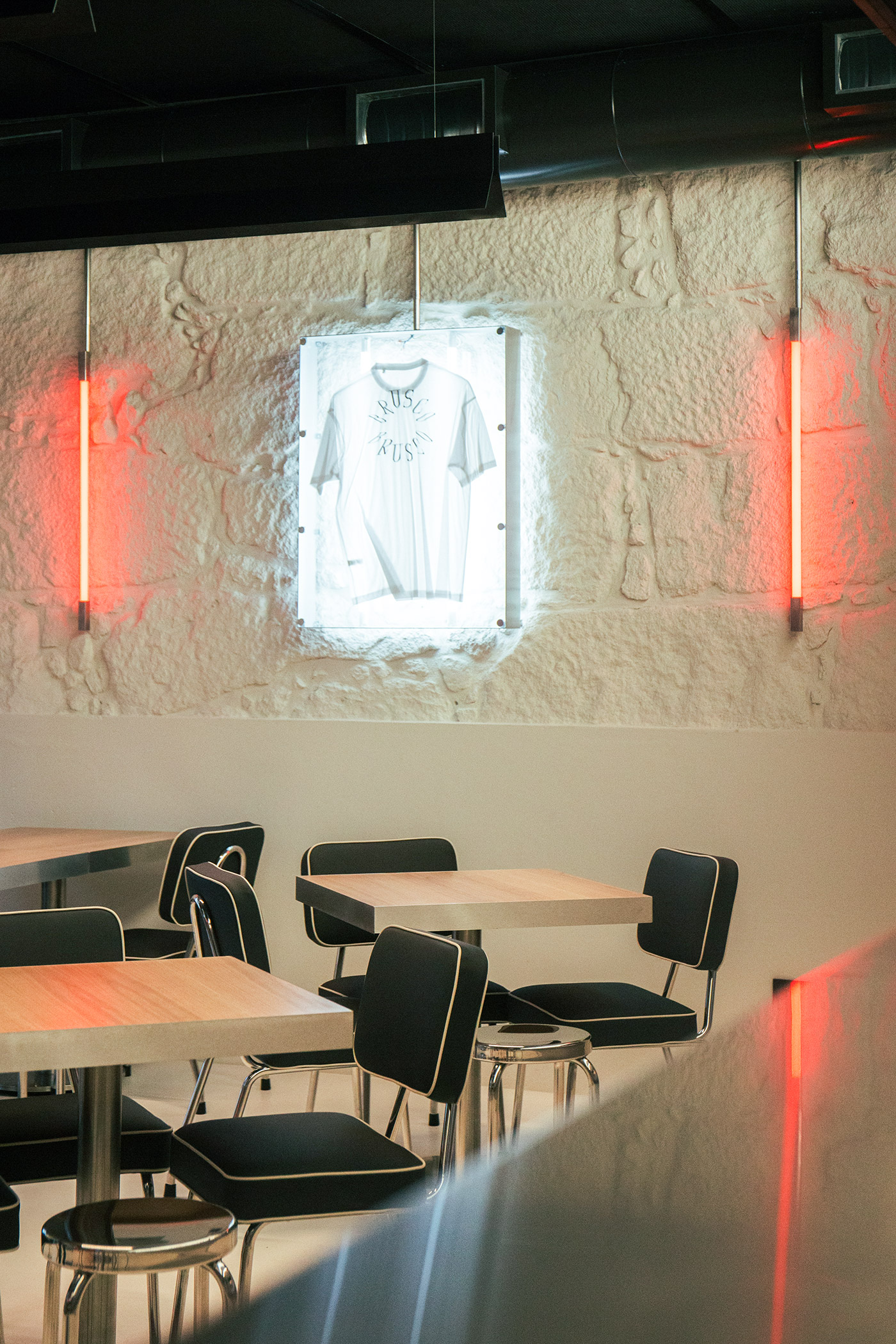
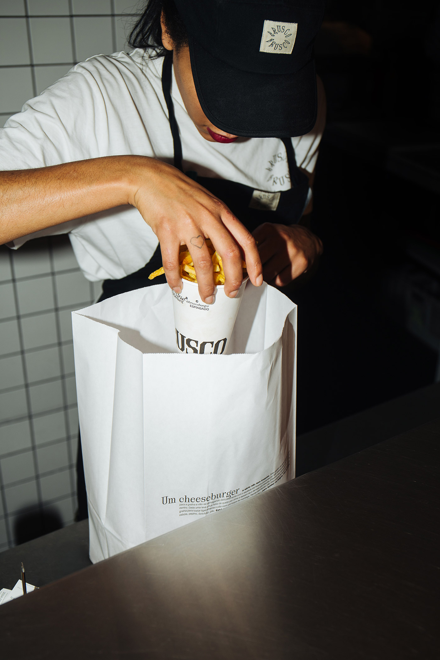
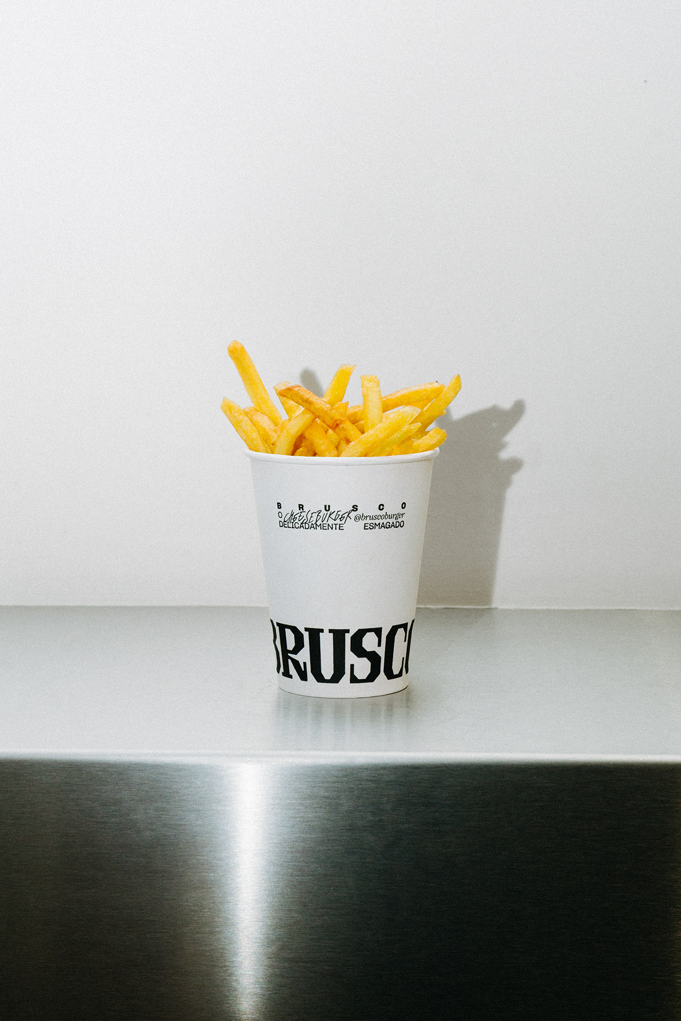
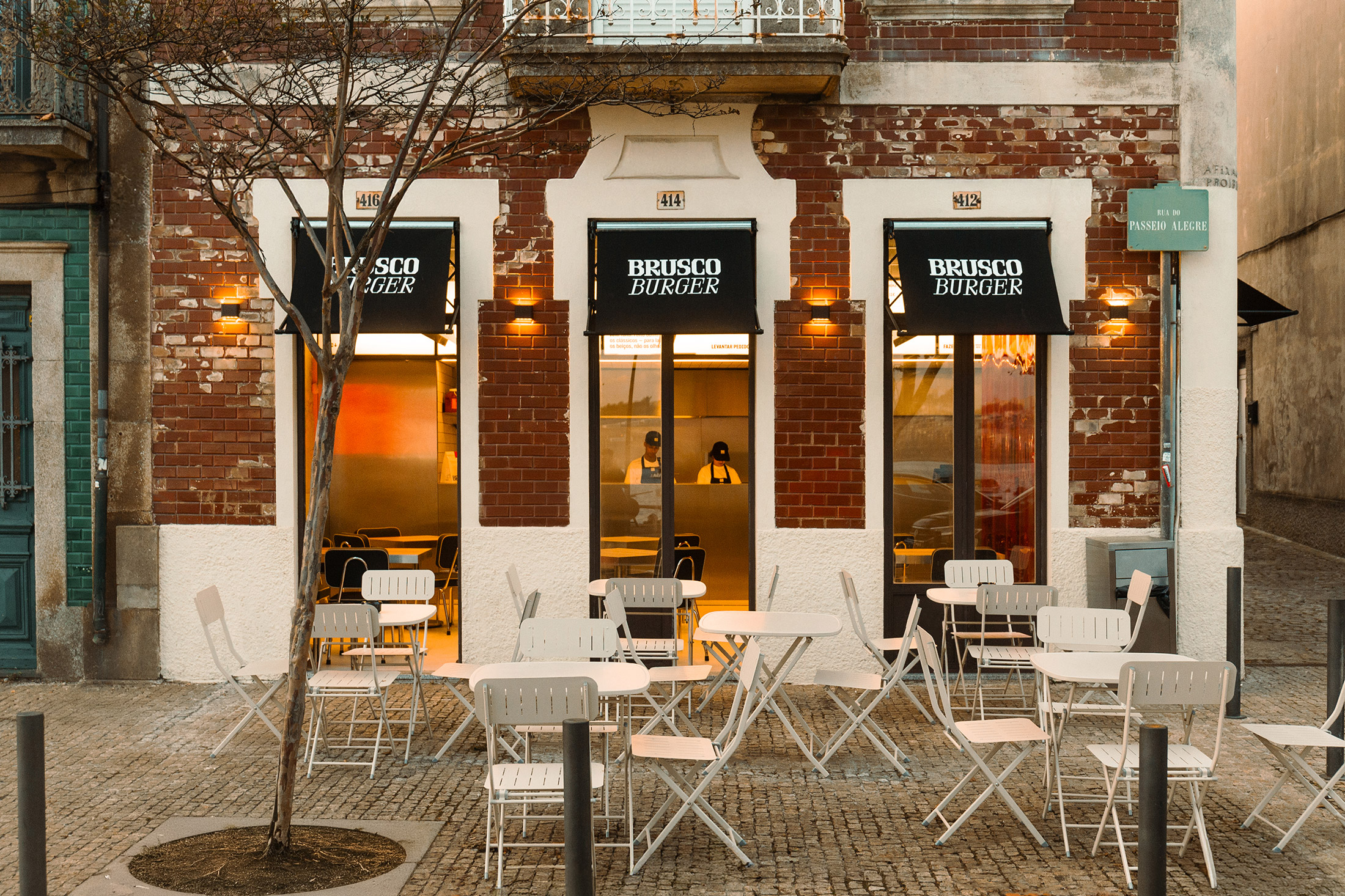
We opted for a type-led visual language — bold, robust and cohesive. With a direct impact on the product, the space and the brand’s communication, it was built using striking graphic elements — such as the boxes and the cups — to serve as a common thread in how the brand connects with its audience. The goal was to create an image rich in nostalgia; a raw, emotional visual language that still feels balanced. The aesthetic mirrors the product itself — the smash burger — with the same spirit in which it hits the griddle: rough, intense, yet disarmingly elegant.
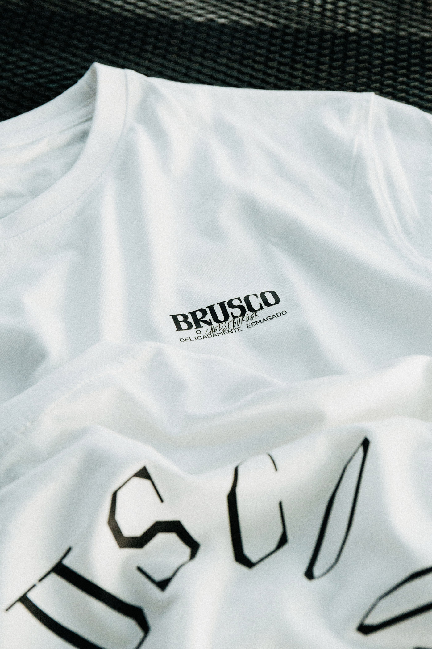
This dichotomy — a premium product treated in a raw, unapologetic way — finds expression in an identity that translates that grit with subtlety and precision. The logo takes centre stage in the brand’s communication, reclaiming its role as the key element of the entire identity.